Reporting
6 Jira Time Tracking Reports Every Project Manager Needs
A project manager doesn’t just need to know what the team is working on. They need to know where the hours actually went. Which project ate the budget? How much of last month was billable? Is anyone quietly drowning in overtime?
Your team logs that data every day. The problem is that native Jira can’t turn it into answers: it captures hours on individual issues but offers no way to slice them across projects, people, activities, or cost. So here are the six worklog reports every project manager needs: what each one answers, why it matters, and how to build it in WorklogPRO in a couple of clicks.
All six come from the same place, Apps → WorklogPRO → Reports, where one report engine gives you a Timesheet, Pivot, Chart, and Worklog view over whatever you filter and group. (For the full mechanics, see worklog reports that actually help.)
1. The team timesheet: who logged what
Answers: Where did the team’s effort go last week or last month?
The foundation report: a grid of hours per day, grouped however your team thinks. Group by User, then Project and Issue, and you get each person’s effort broken down by the work they did, with subtotals down the side, days across the top, and target-based color-coding (green when a day’s target is met, red when it’s over).
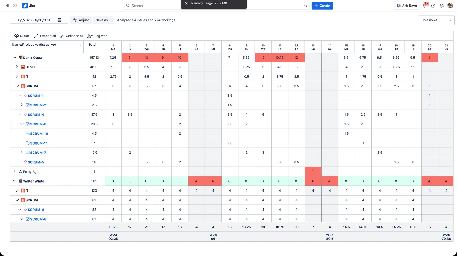
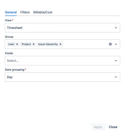
Build it: in the Create Report dialog, set the View to Timesheet and stack the Group as User → Project → Issue hierarchy.
Why a PM needs it: it’s your single source of truth for effort. Before any deeper analysis, this is the report that tells you the month actually got logged, and surfaces the gaps when it didn’t.
2. Effort by project and epic: where the budget went
Answers: How much effort did each project, client, or epic consume?
Group the same worklogs by Project, then by Epic or Issue, and the hours roll up into a clean hierarchy. Now you can see that one client took three times the effort of another, or that a single epic quietly absorbed half the sprint.
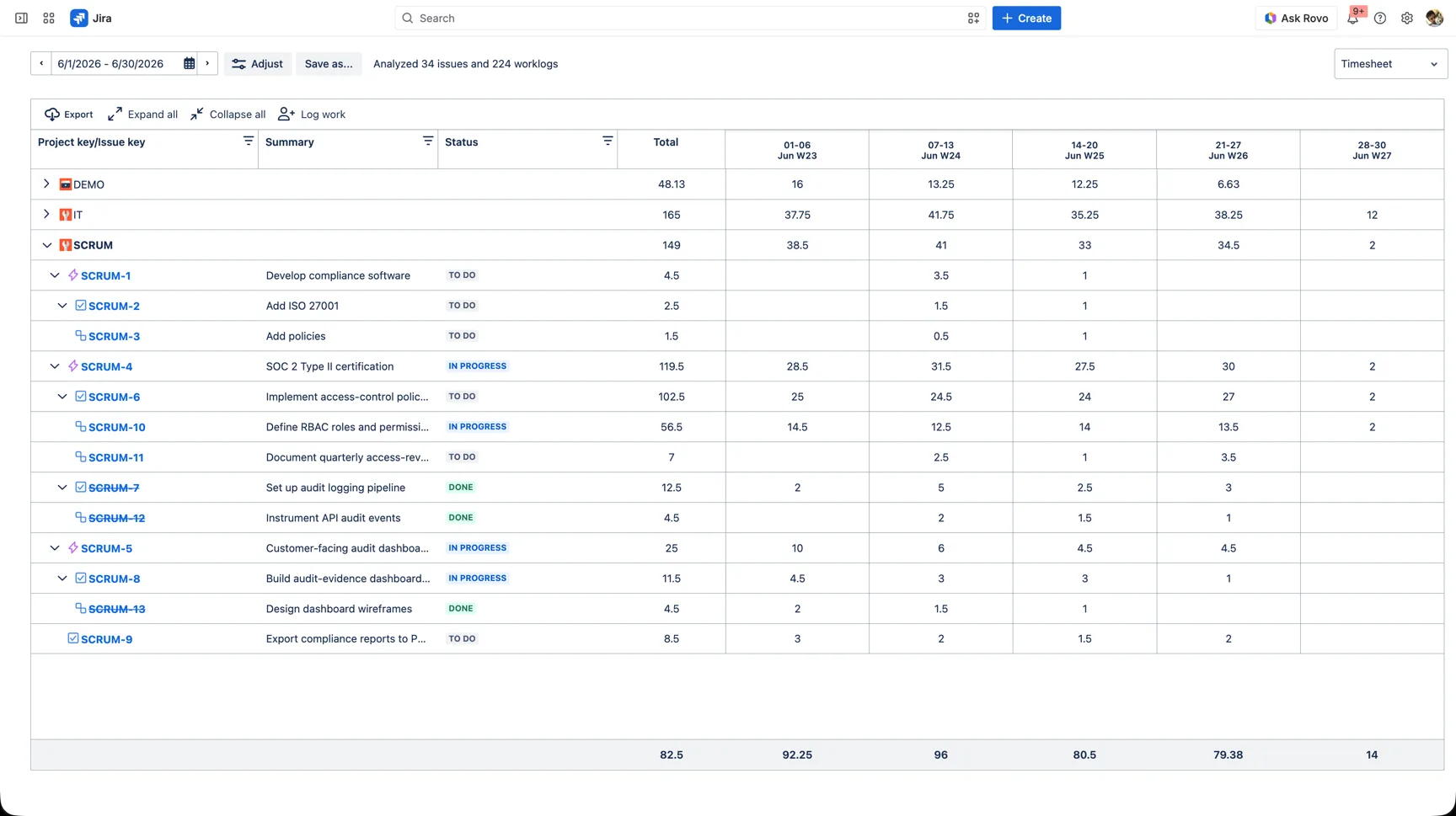
Build it: Group by Project, then Issue hierarchy, which nests epics, their tasks, and subtasks automatically. (Add Summary and Status as Fields, and set the grain to Week, for the view above.)
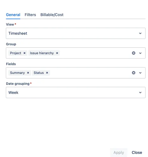
Why a PM needs it: it turns “we’ve been busy” into “this is where the time went.” Essential for status reports, client conversations, and spotting the projects that are quietly over-running.
3. Billable vs non-billable: how much time earns revenue
Answers: What share of our hours is actually billable?
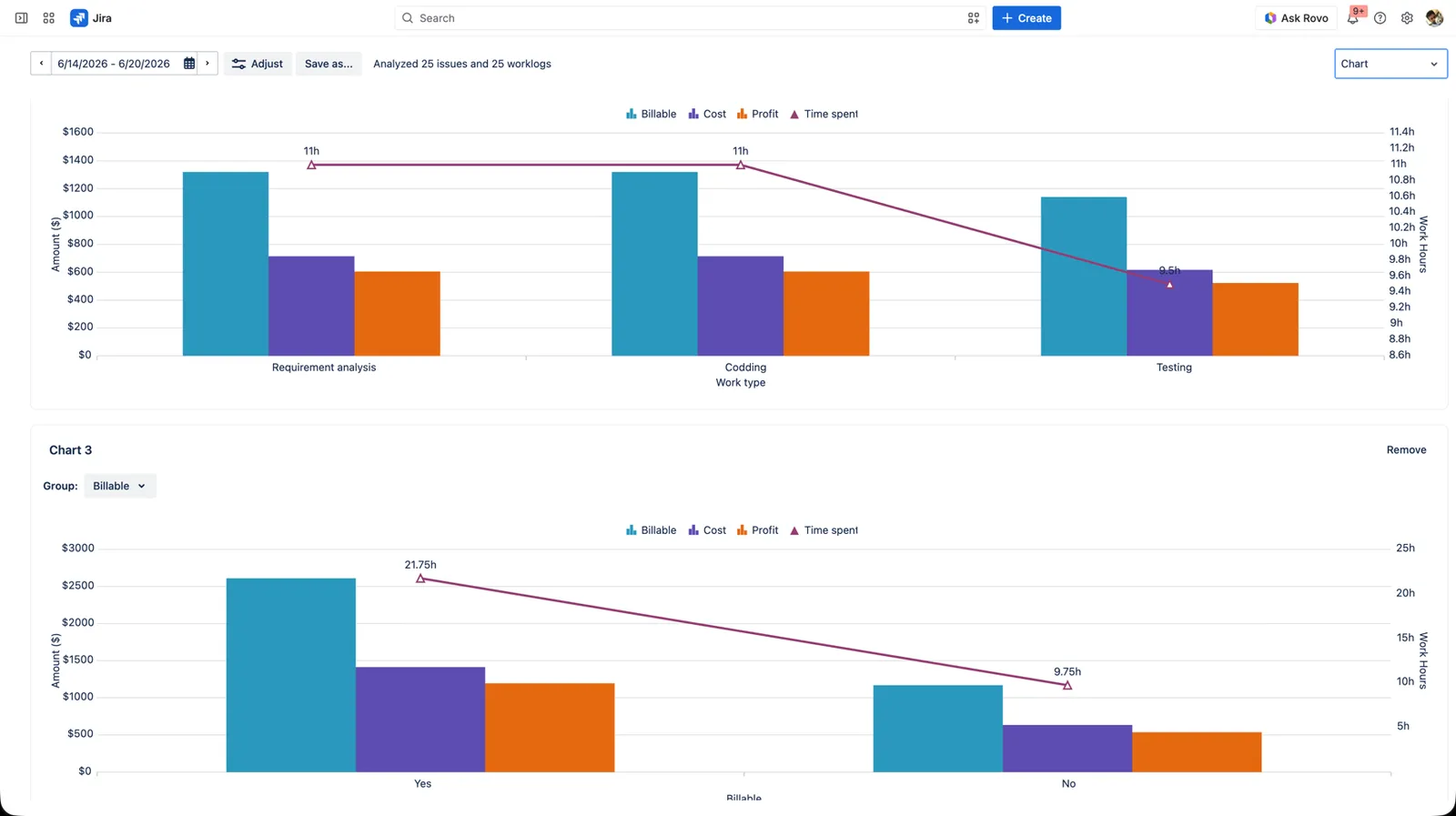
If you’ve defined a Billable worklog attribute, you can split every hour into revenue-generating and not. Group a Pivot or Chart by that flag and the ratio is immediate: per project, per person, per period.
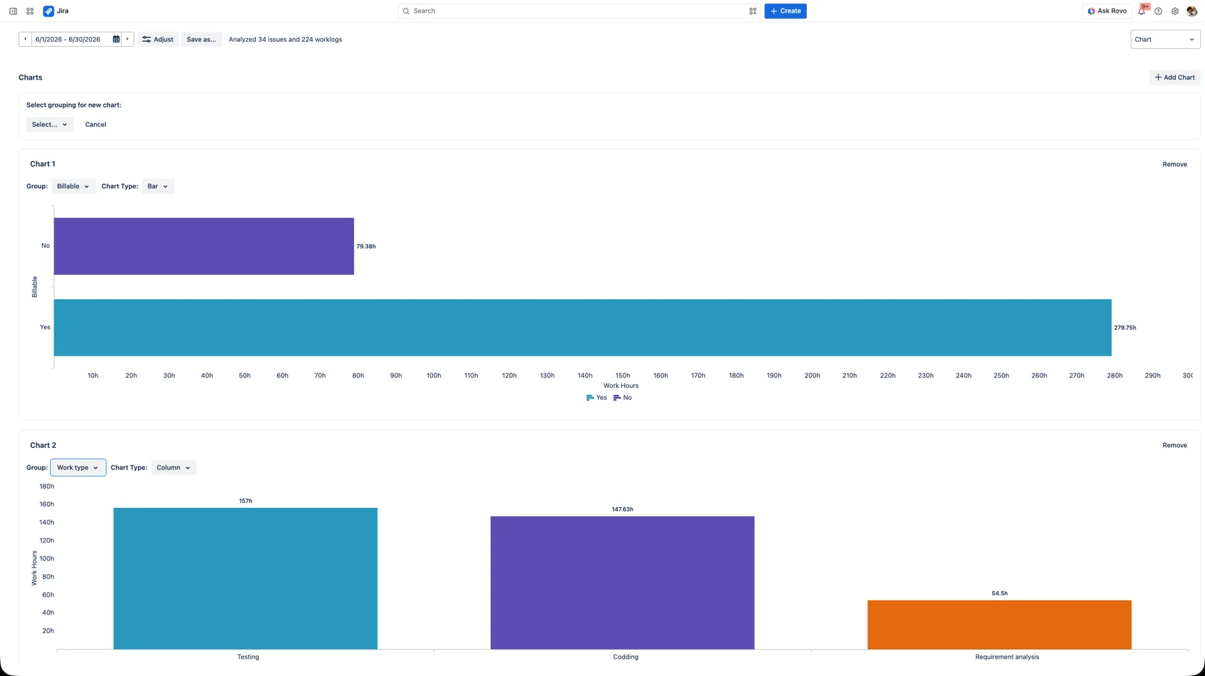
Build it: switch to the Chart view, click Add Chart, and set its Group to Billable. You can stack several charts on one report: here a second is grouped by Work type.
Why a PM needs it: utilization is the heartbeat of any client-billable team. A falling billable ratio is an early warning that admin and rework are eating the margin.
4. Effort by activity: dev vs testing vs rework
Answers: What kind of work is the time going into?
Capture a Work type attribute (Development, Testing, Analysis…) and you can read effort by activity. Drop Work type into a Pivot’s columns and suddenly you can see how much of a “feature” project was actually rework or testing.
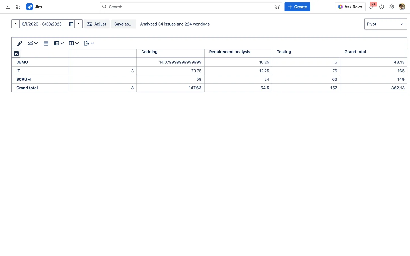
Build it: in the Pivot view, put Project in Rows, Work type in Columns, and Time spent in Values.
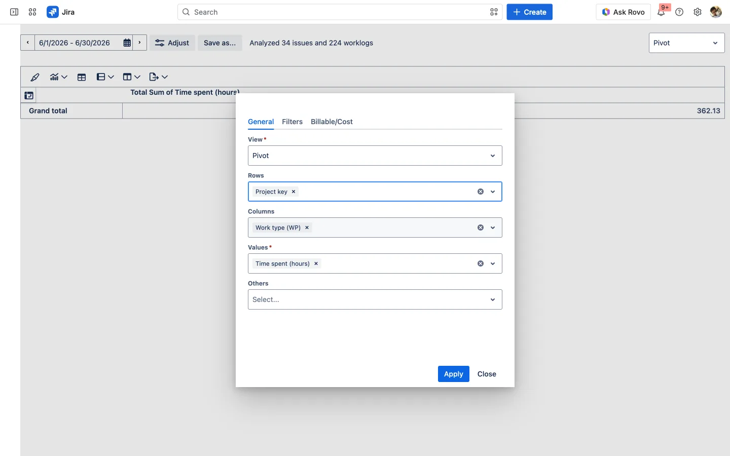
Why a PM needs it: activity mix is where estimation goes to die. If testing or rework consistently dwarfs your estimates, this report is the evidence that fixes your next plan.
5. Cost and profitability: did it make money
Answers: What did this work cost, and did it earn more than it cost?
Attach rate tables, a billable rate and a cost rate, and the report grows money columns next to the hours: Billable, Cost, Profit, and Profit Margin %, all computed automatically.
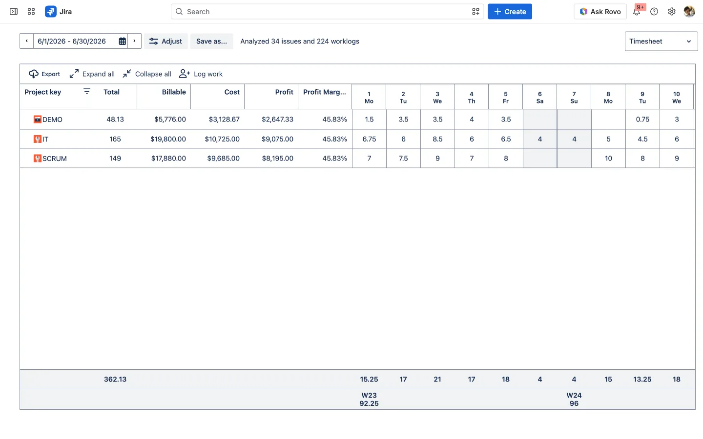
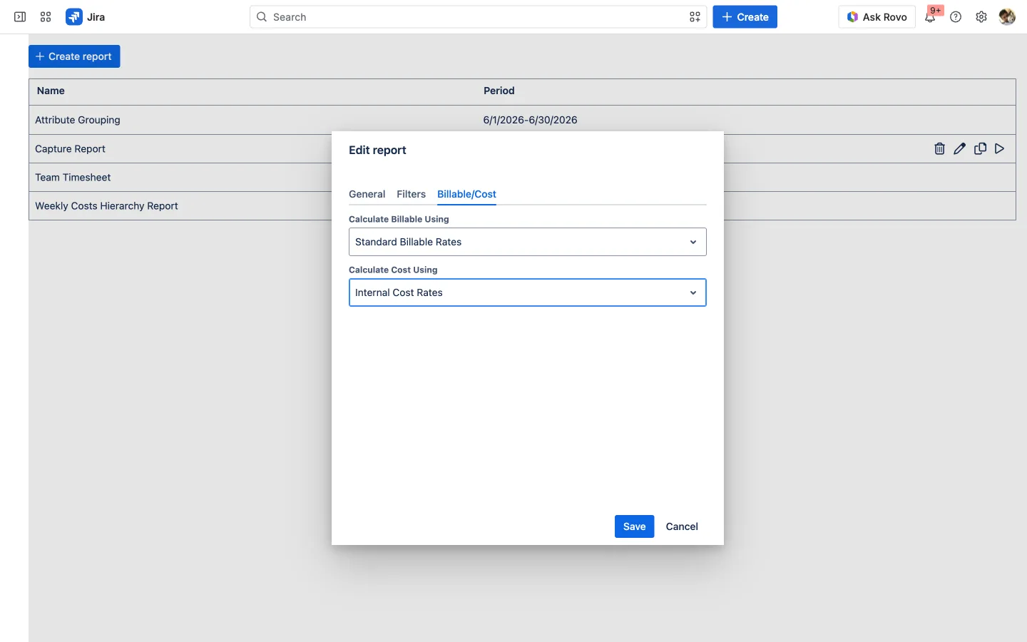
Build it: on the report’s Billable/Cost tab, set Calculate Billable Using and Calculate Cost Using to a matching-currency pair of rate tables.
Why a PM needs it: “on time” means nothing if the project lost money. This is the report that tells you which work is worth doing more of, and which client is quietly unprofitable.
6. Capacity and overtime: who’s overloaded
Answers: Who’s under capacity, who’s over, and who’s logging too much overtime?
Define a Work Hours Schema and WorklogPRO knows each person’s daily target. The Work Calendar then shows logged-vs-target at a glance: 31.38h / 40h for the week below, with Wednesday’s 9h over the 8h target flagged.
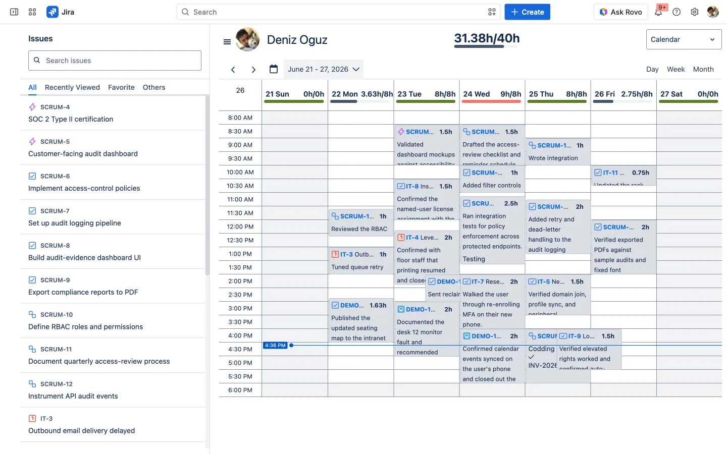
Build it: set daily targets once in the Work Hours Schema (in WorklogPRO’s admin); the Calendar and the timesheet’s color-coding flow from it.

Why a PM needs it: sustained overtime isn’t productivity, it’s risk. Pair the calendar with an Overtime attribute and you can spot burnout before it becomes attrition.
Quick reference: which report when
| When you need to know… | Reach for |
|---|---|
| Where the team’s hours went | 1. Team timesheet |
| Which project/client consumed effort | 2. Effort by project & epic |
| How much time is billable | 3. Billable vs non-billable |
| What kind of work it was | 4. Effort by activity |
| Whether it made money | 5. Cost & profitability |
| Who’s overloaded | 6. Capacity & overtime |
From data to decisions
Six reports, one report engine, all reading the worklogs your team already creates: no exports, no spreadsheets, and the numbers stay live inside Jira. The team timesheet tells you what happened; effort-by-project and effort-by-activity tell you where it went; billable, cost, and capacity tell you whether it was worth it and whether it’s sustainable.
And when you need those numbers to be trusted, for billing or the quarter-end close, run them through timesheet approval so what you report is confirmed, not just logged.
Try it on your own Jira. WorklogPRO is on the Atlassian Marketplace with a free trial. Open Apps → WorklogPRO → Reports and build the first of these six in under a minute.
This article is part of our Jira time tracking guide: plan, bill, and scale smarter.